
MakeFixHack

“Saleem did a wonderful job of reflecting both the functional needs of our business and the values of our stakeholders. We are grateful for the high quality work he did for us.”
Dave Terkanian, Director of MakeFixHack
Role
UX/UI Designer
Year
2024
Project
UX Research and Website Design
The Client
MakeFixHack Easthampton is a community group for makers, tinkerers, hackers, and crafters, focused on advancing technology through hands-on learning and collaboration, and the development of the maker space.
The Challenge
MakeFixHack needed a stronger digital presence to engage the community and grow. The outdated site made it hard to attract members, donors, and support.
The Objective
Improved usability, a clear voice, and stronger branding now help MakeFixHack attract members, donations, and local momentum.

Research: Understanding the Community
I began by listening. Through stakeholder interviews and community conversations, I discovered that the barrier to engagement wasn't a lack of interest—it was a lack of clarity.
What I did
Stakeholder Interviews: Identified board-level goals for physical makerspace growth.
Community Survey: Collected responses from local makers to map their journey from "curious" to "member."
Affinity Mapping: Synthesized qualitative data to find patterns in user frustration.
Competitive Analysis: Evaluated how other successful maker hubs balance "technical" vs. "accessible" tones.

The "Aha!" Moment
I realized the website was suffering from platform abandonment. The mobile calendar was so high-friction that users bypassed the site entirely for Meetup.com. Surprisingly, even tech-savvy members wanted to strip away "hacker" tropes in favor of utility and welcoming clarity.
By failing to be the primary resource for events, the website was losing the opportunity to convert visitors into donors or long-term members. My goal shifted from just "fixing a calendar" to restoring the site as the community’s single source of truth.
Core Challenges
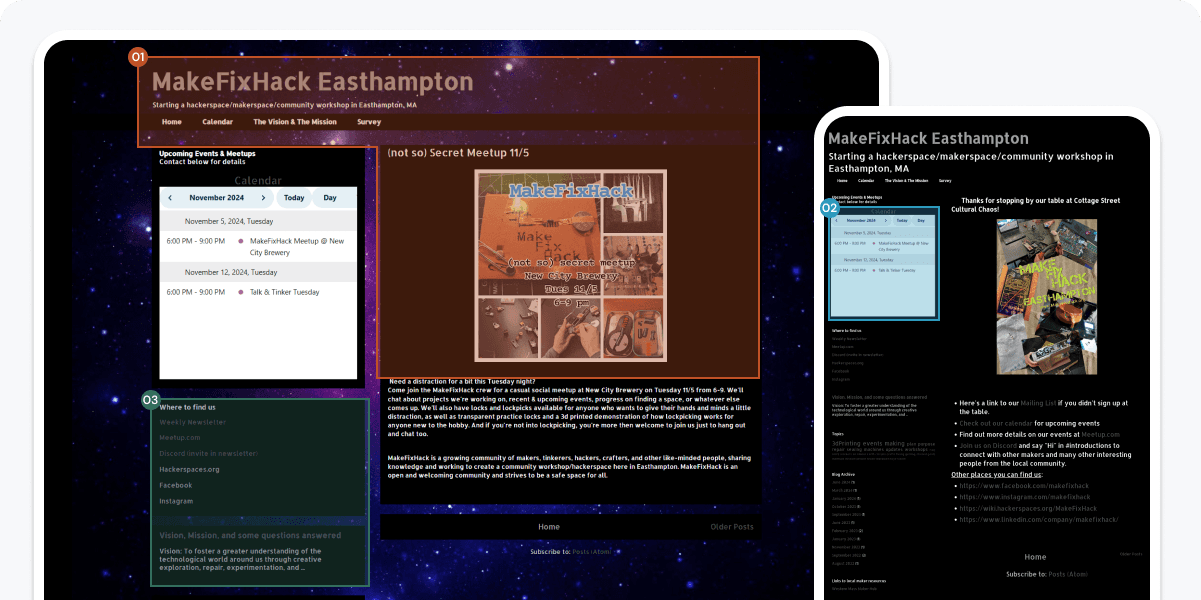
01
Tone felt exclusionary:
The "hacker" aesthetic signaled "experts only," deterring hobbyists and beginners.
02
Information Friction:
Users searched for events on mobile, but the site’s non-responsive calendar made RSVPing nearly impossible.
03
Hidden Opportunities for Impact:
Community members wanted to help build the space but lacked clear pathways to contribute.
These findings clarified where the experience was falling short and defined three focused design challenges. Each solution below directly addresses a user need uncovered through research.
The First Challenge
Shifts the visual tone to feel more inclusive, welcoming, and aligned with the community’s collaborative energy.
The Problem
An outdated "tech-heavy" aesthetic created a high barrier to entry. This masked the inclusive, hands-on spirit of the Easthampton maker community.
The Approach
Reimagined the visual language using a tactile, earthy palette inspired by the Easthampton outdoors to ground the digital experience in the physical world.
The Outcome
A welcoming, place-based identity that successfully translates passive digital visitors into active, local participants and supporters.
Design Decisions

Humanizing the Maker Experience
Replaced technical, abstract imagery with photography of people and hands at work. This signals a welcoming environment and provides social proof that the group is built on collaboration rather than just technical expertise.
Locally Inspired Palette
Transitioned to a grounded palette inspired by the Easthampton landscape. By utilizing high-contrast, accessible tones, I improved legibility and created a welcoming atmosphere that moves away from the exclusionary feel of an underground hacker group.
Grounded Typography & Voice
Selected approachable, humanist typefaces that feel "of the place," using conversational language to lower the barrier for newcomers while building trust with local supporters.
Softened Interactive Elements
Utilized rounded corners and organic UI shapes to reduce the sharp feel and lower the perceived barrier to interaction.
The Second Challenge
Restructures and prioritizes key event info for mobile to improve community engagement.
The Problem
A non-responsive calendar iFrame made mobile navigation impossible. This friction forced users to abandon the site for Meetup.com, resulting in missed events and lost community engagement.
The Approach
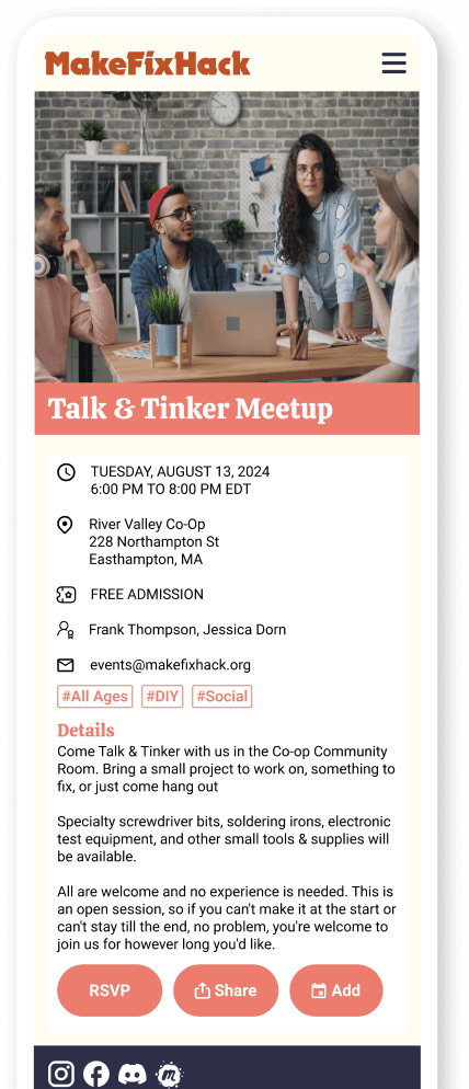
I transitioned the event experience from a date-centric iFrame to a mobile-first list view. This strategy prioritized immediate action and provided the "Human Metadata" that newcomers needed to feel confident attending.
The Outcome
Visitors can now find, assess, and RSVP for events in seconds. This new structure restored the website as the community’s primary resource and improved task success by 85%.
Voices from the Community

The Navigation Trap


The site relied on an embedded calendar that was not responsive, causing severe navigation issues and trapping users within a cramped mobile view.

The monthly layout created large empty spaces and provided minimal context, making it difficult for users to quickly scan for upcoming events or community activity.

Event pages provided only surface level details, leaving users without a clear call to action or the information needed to feel confident attending.
Design Decisions

Human-Centered Imagery
Used inclusive photography and messaging to build social trust and signal that the group is open to all skill levels.
Mobile-First Event Feed
Replaced the rigid calendar iFrame with a scannable list view to eliminate navigation traps and reduce user drop-off.
Active Participation Pathways
Introduced a "Submit Your Idea" workflow to transform passive visitors into active community contributors.
Tangible Social Proof
Added archived events and photos to help newcomers visualize the space and feel confident attending for the first time.
Scannable Visual Hierarchy
Utilized structured cards and elevated titles to anchor the mobile experience and reduce cognitive load.
Designing for Social Safety
Integrated host details and skill tags to help users assess fit. Providing a face to the event reduces newcomer anxiety and fosters a sense of preparedness.
Streamlined Action Pathways
Implemented persistent RSVP and sharing tools to create a frictionless transition from event discovery to active participation.
The Final Challenge
Introduces clear donation pathways and supportive messaging to turn passive interest into active contributions.
The Problem
While MakeFixHack aimed to open a physical makerspace, the legacy site lacked a clear value proposition or a functional way for visitors to support that mission.
The Approach
I integrated high-visibility donation and sponsorship CTAs throughout the site. I also replaced transactional language with supportive microcopy that highlighted community impact over simple funding.
The Outcome
Clear donation pathways and embedded tools transformed the website into a functional fundraising resource, bridging the gap between community interest and financial support.

Impact-Driven Microcopy
Reframed contributions as a shared mission to build the makerspace together. This shifts the tone from a simple transaction to an invitation for community impact.
Frictionless Giving Tools
Implemented visible calls to action and embedded donation tools to eliminate third party redirects. This makes supporting the nonprofit immediate, accessible, and secure for individual donors.
Professional Partnership Pathways
Developed a professional entry point for local business investment. By clarifying sponsorship benefits, I created a clear channel for larger scale organizational support.
Retrospective: What I Learned
Balancing Legacy with Inclusivity
Through stakeholder discussions, I discovered that the "hacker aesthetic" was the preference of a single creator rather than the group’s mission. I learned how to navigate sensitive legacy dynamics by refocusing the conversation on our shared goal: creating a welcoming environment for all skill levels.
Pragmatic Prioritization over Feature Creep
The interview process surfaced a vast list of aspirational features. I learned to distinguish between "needs" and "wants" by anchoring decisions in user data. This allowed me to build a solid foundation that addressed immediate friction while leaving room for future scalability.
Leading Through Strategic Alignment
With stakeholders initially divided on their "North Star" and target audience, I facilitated a process to find common ground. I learned that project success depends on more than just design; it requires aligning diverse personalities around a unified purpose to move the work forward.
